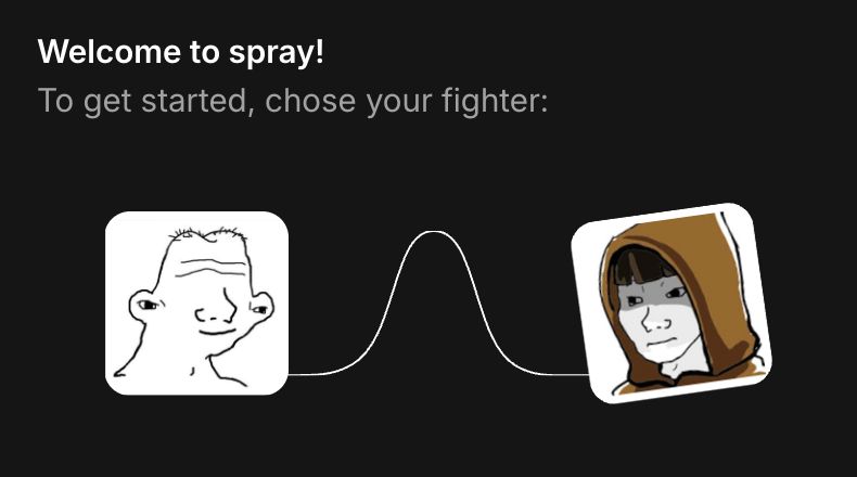
Spray early audit
Good job everyone, platform is looking good.
Quite a lot of small fixes needed though,
here are our first returns :
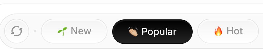
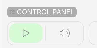
Wrong hover state
Missing 'wave' animation
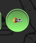
PFP tilting the wrong way
Informational animations missing
'P' should be capital letter
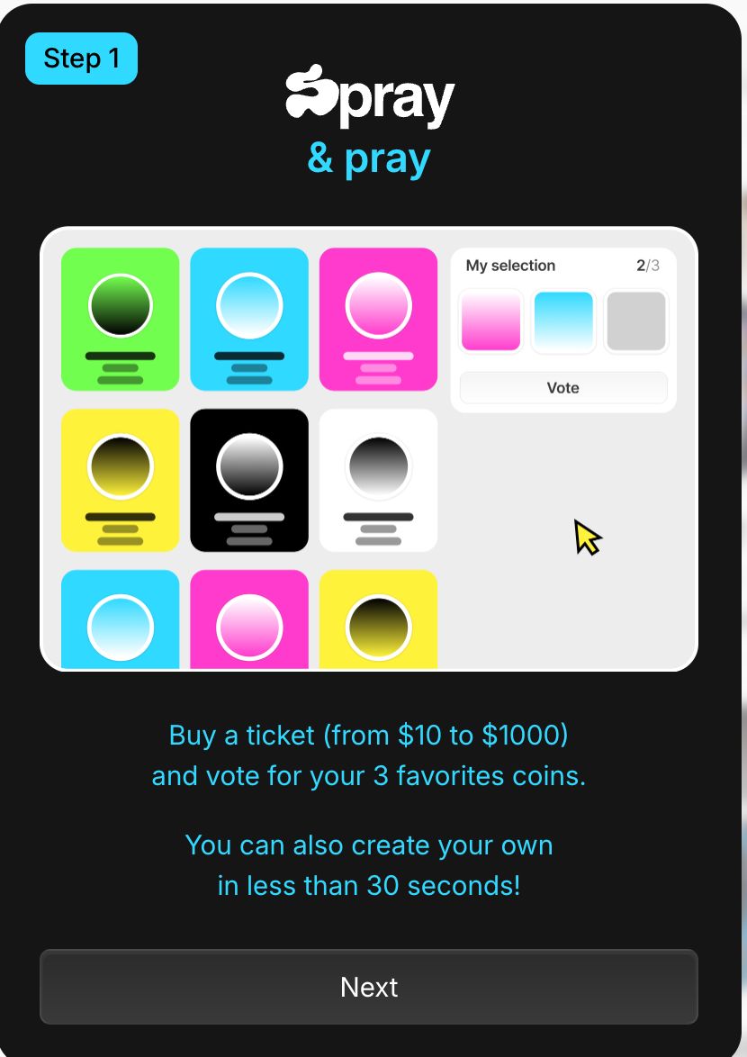
We'll most likely provide upgraded graphics for each title later
The cursor should reveal the underlying gradient ; currently the gradient is going from the start to the cursor.
The color should be dynamically picked from where the cursor is at on the gradient ; currently the color changes with each 'step' in the bar.
The numbers should be an input field, allowing users to type the exact amount they want.
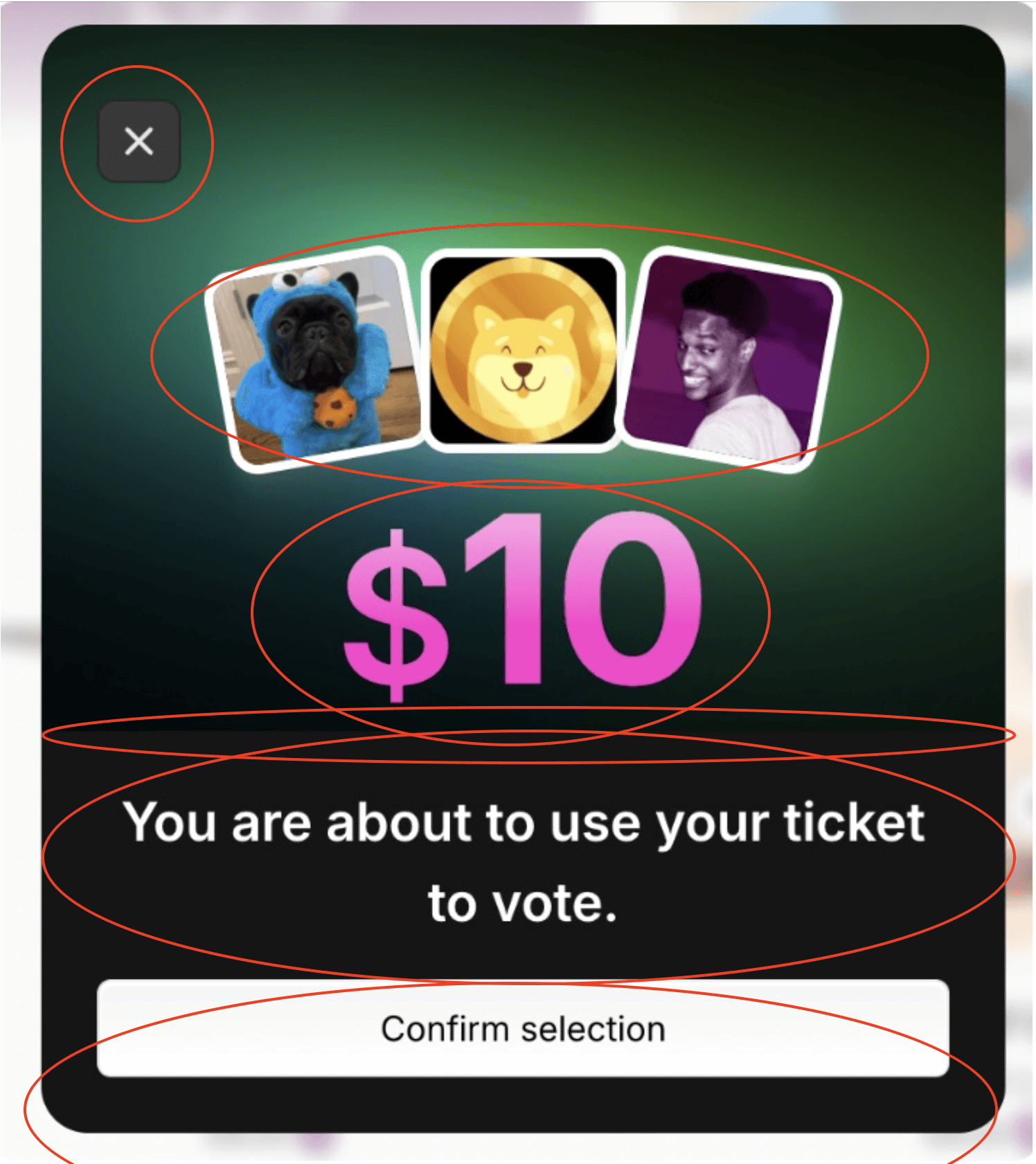
Missing a cross icon to close the modal
Wrong styling / effect on the main numbers

Weird sharp delimitation instead of gradient fade in the middle
Missing capital 'T' on tickets
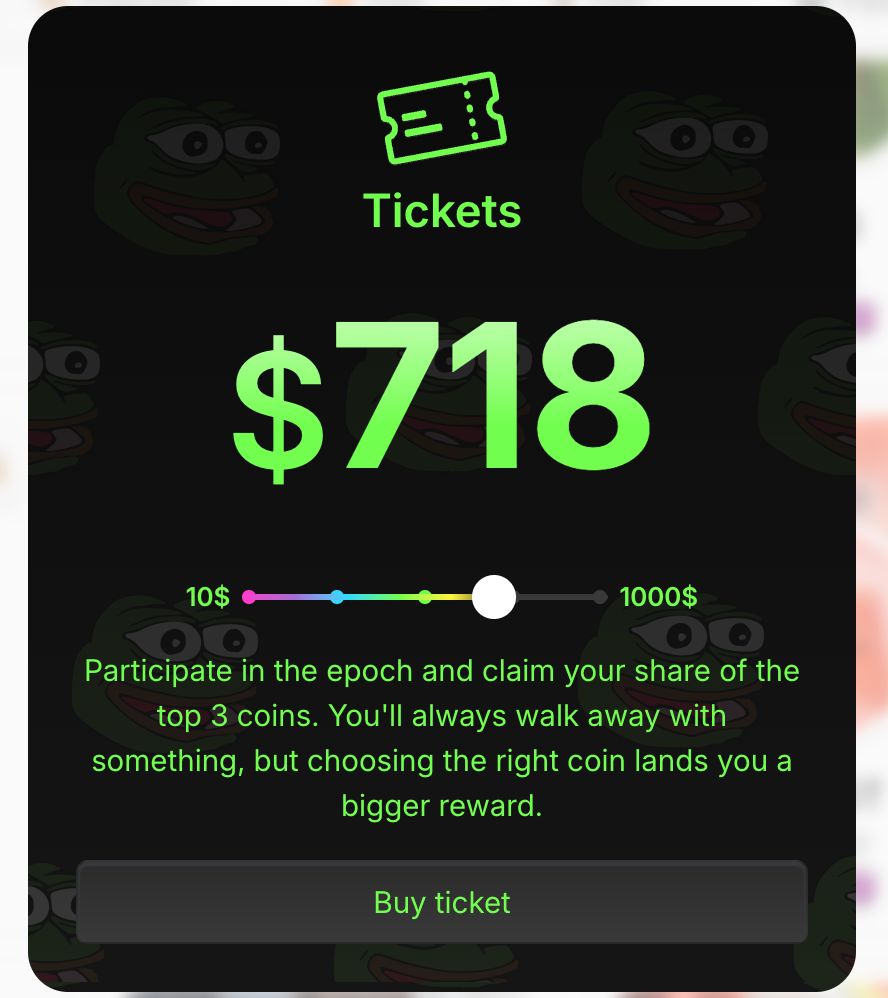
Cross is wrongly positioned
Wrong line height on title
Token cards are placed weirdly and missing drop shadow
Weird sharp delimitation instead of gradient fade in the middle
Wrong text effect on the main numbers
Cross is wrongly positioned
Token cards are placed weirdly and missing drop shadow
'You are about to' text is wrong (truncate, line height..)
Wrong radii on button
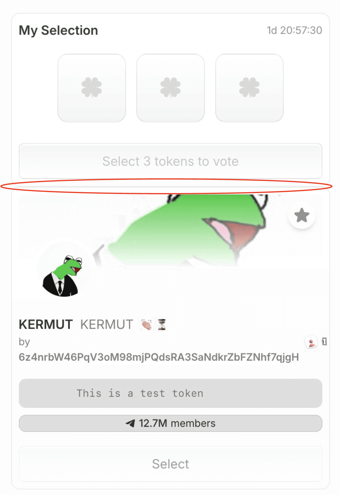
Missing marging
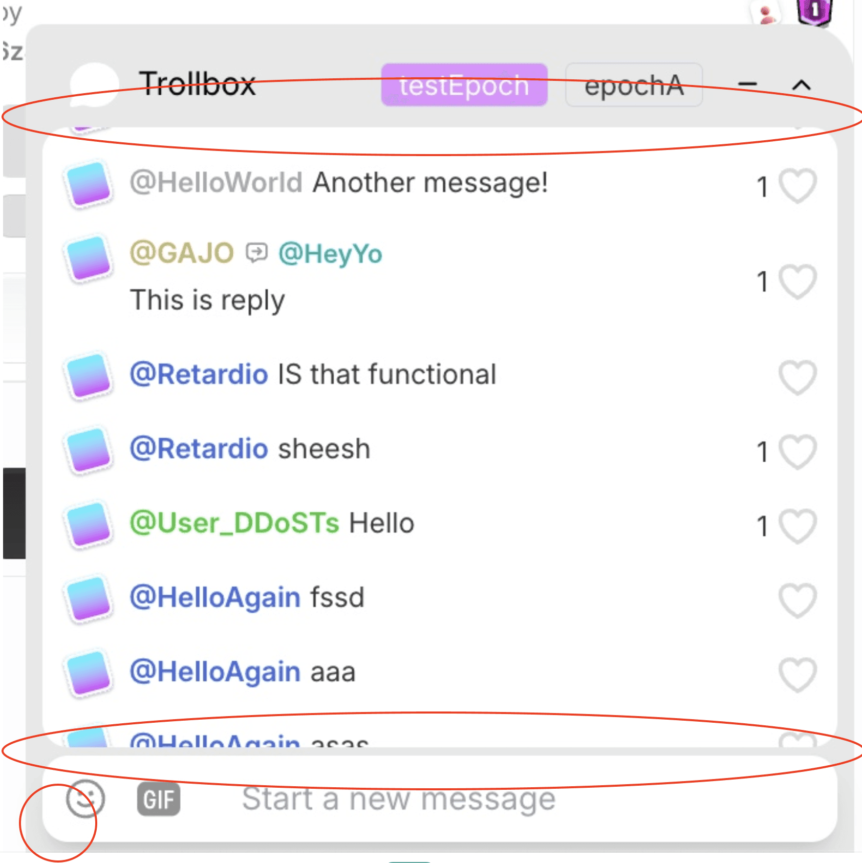
Margins are off
Padding at the top is wrong
Should be called 'Trenchbox'
Wrong radii on message input
Drop shadow on message input is not in our design
Missing hover states on messages
Reply animation on the PFP should happen on hovering the message, not the PFP (clicking it triggers the reply)
Reply state is not the same as Figma (should have slight tint of OP's username)
Cross to close reply state shouldn't be pink. Add hover state on cross (opacity change)
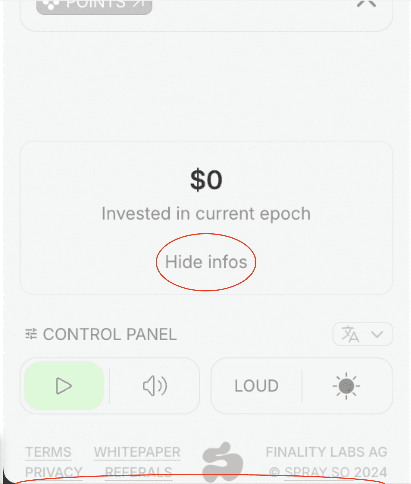
Infos should be a tooltip
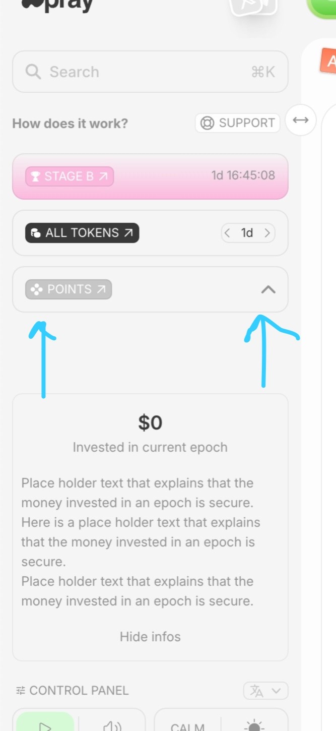
The 'currently invested' box needs to be right after 'Points', not aligned to the bottom
Missing padding on the bottom of the sidebar
The 'currently invested' box is not present in Stage A
Wrong padding / size
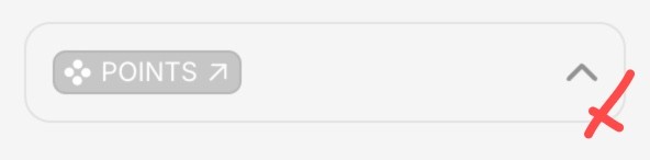
Arrow in 'closed' state is pointing the wrong direction
Make the whole box clickable to expand and only the icon clickable to collapse
Missing spacing, overall doesn't look like provided design
Needs hover state (Our fault, will provide design soon)

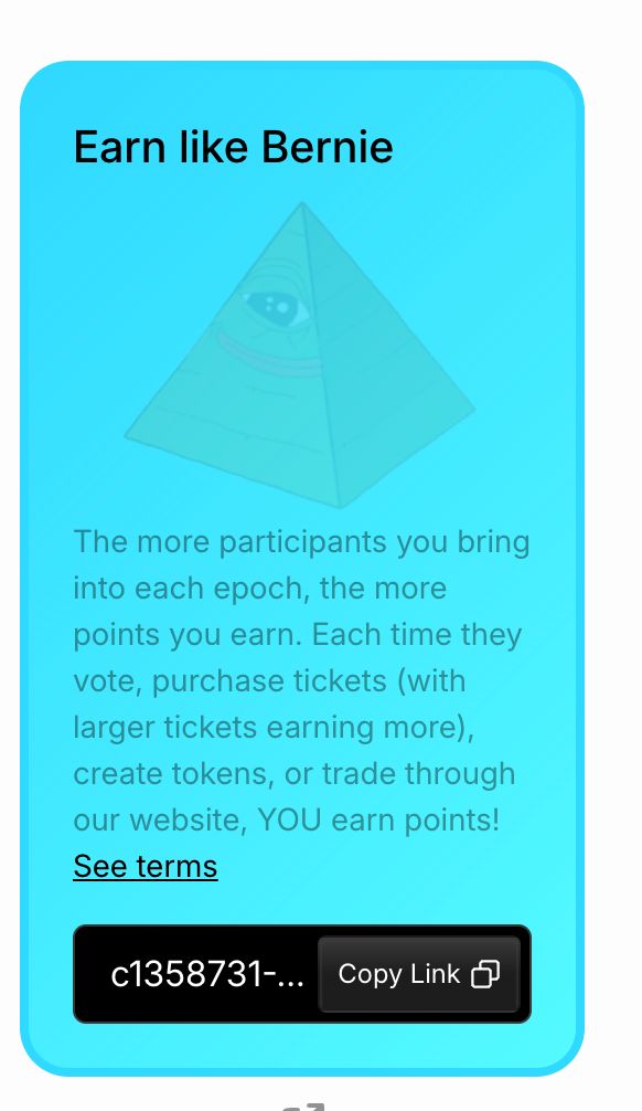
Description is faulty
Social label is faulty
Button is faulty
Fav button is faulty
Texts have wrong weights, wrong sizes
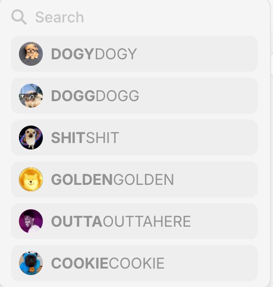
Truncate address hash to something shorter (only display first and last 3 char?)
Weird shadow
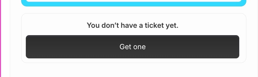
Just don't display this box. Prompt comes during voting flow
Useless hover state (can't be clicked)
Icon needs a white background and needs to be smaller in the frame (padding). Please provide us the dimensions if you need us to design it
Video needs to be in blend mode: overlay at 100% opacity, not lower opacity
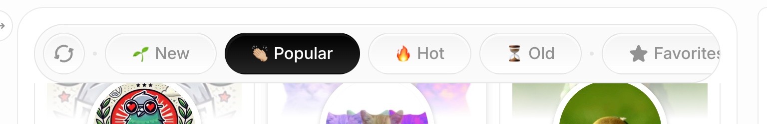
Missing white gradient below the filter bar to 'fade' the scroll
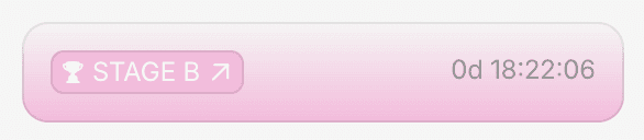
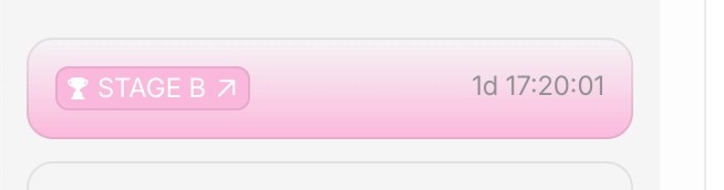
No need to display '0d'

Cards should flip and 3D rotate 180 degrees on clic, not slide up
Please hint at that flip on hover by rotating it 2 degrees
Not respecting animations provided in Figma overall
The page shouldn't have a sidebar and the cards should not be nested in a box
The background should be gray in light mode (refer to Figma)